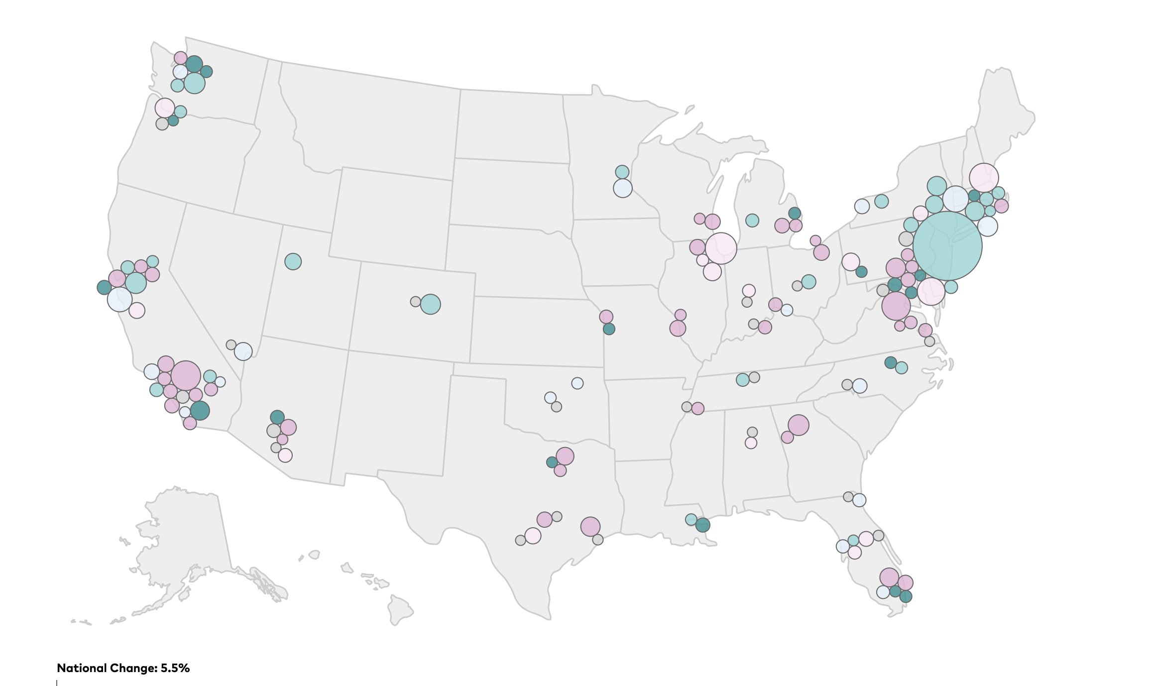
Last year we brought you Transit Insights, a visual tool to track changes in transit ridership, service hours, fares, and other important indicators of transit quality in American cities. We’ve just released a new version, with fresh data and features to make it even easier to explore transit trends. Here’s a look at what’s in the update.
New ways to look at bus and rail data
With the updated website, you can look up key metrics of transit operations and performance by different modes. This can help illuminate how public policy influences changes in ridership.
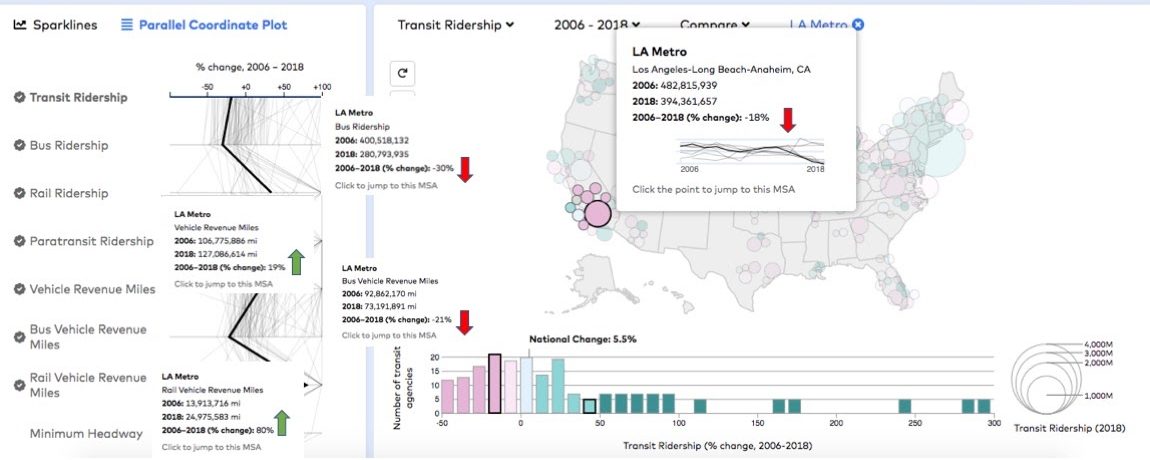
Take LA Metro, the main transit agency in Los Angeles. Metro’s overall vehicle revenue miles (VRM) increased 19% from 2006 to 2018. Usually people respond to greater levels of service by riding transit more, but LA Metro’s overall transit ridership actually decreased 18% during this same period. Using Transit Insights, you can isolate VRM by mode, which makes sense of these seemingly contradictory trends.
Breaking down the change in service volume by mode, bus service miles actually decreased 21%, while rail increased 80%. That helps explain why bus ridership, which accounts for most trips people take on LA Metro, declined 30% over this period.
In addition to the mode-by-mode metrics, Transit Insights has two new indicators: paratransit ridership and average monthly housing rent. And all data has been updated to the most recent years available (through 2018 for most data; through 2017 for LEHD jobs data).
More legible demographic information
In addition to transit metrics, Transit Insights includes layers of demographic data for regions and census tracts. With the update you can pull up demographic information for each year from 2010 to 2018. Previously this data had only been viewable as changes over time. Making the data available year-by-year makes it easier to compare demographic characteristics across geographic areas and see how they relate to transit.
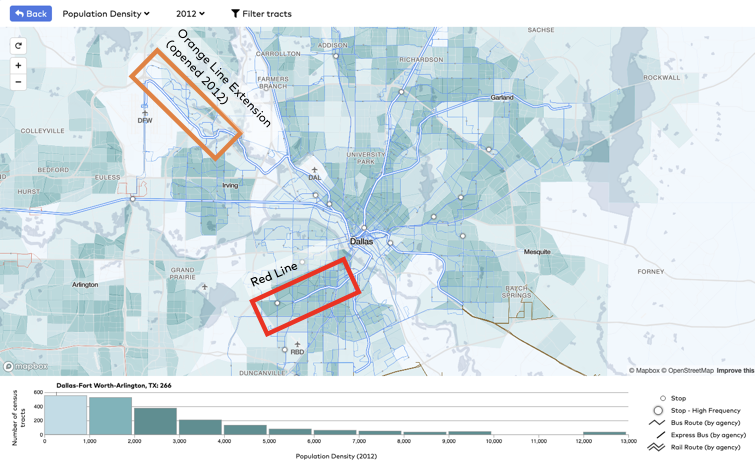
For instance, single-year demographic data demonstrate that when DART opened the extension of the Orange Line to Dallas-Fort Worth Airport in 2012, the residential patterns around the new stations were worse suited for rail service than other parts of Dallas. The Orange Line extension was built through communities that were less dense, had higher median incomes, lower proportions of zero-car households, and lower shares of transit commuters in 2012 than the area southwest of the Red Line. By choosing the Orange Line extension, elected officials and transit policy makers prioritized transit service for visitors, business travelers, and airport workers over investments elsewhere in the region that would have served more residents. As of 2018, the Orange Line had the lowest ridership of DART’s four light rail lines.
A better user experience
New features in Transit Insights make it easier to use, including:
- Clearer comparisons between cities: When comparing metrics from different agencies or regions using the “parallel coordinate plot” or “sparklines” features, color-coding makes it easier to distinguish between trendlines. Hover captions also include data points for the first and last year of the time selection and the percentage change over that period of time.
- Focus on demographic data near frequent transit: In the regional view, you can “filter tracts” to view demographic trends in neighborhoods within walking distance of all high-frequency transit, or you can view high-frequency transit provided only by a specific agency.
- Built-in glossary: Users can hover over each metric in the dropdown list to view definitions for each. In addition, check marks signify which transit and demographic data are most consistently collected and reported, with the lowest margins of error.
We’re excited to share these new features with you and welcome your questions about how to use the tool, suggestions for improving the tool, and examples of real-world application of Transit Insights in your work. Send your feedback to [email protected] or tweet @TransitCenter.
Transit Insights draws on standardized data from the FTA’s National Transit Database, U.S. Census Bureau American Community Survey and LEHD, and Transit.Land.
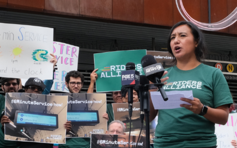 Built to Win: Riders Alliance Campaign Secures Funding for More Frequent Subway Service
Thanks to Riders' Alliance successful #6MinuteService campaign, New York City subway riders will enjoy more frequent service on nights and weekends, starting this summer. In this post, we chronicle the group's winning strategies and tactics.
Read More A Transit Revolution in Philadelphia?
The Southeastern Pennsylvania Transportation Authority (SEPTA) has been working throughout the pandemic on several system-wide planning initiatives that have the potential to transform transit service in and around the city of Philadelphia.
Read More