Pledges made earlier this summer by Governor Cuomo and MTA chair Joe Lhota about fixing NYC’s subways and reforming the MTA are falling like dominoes. In June, Lhota pledged a “top to bottom audit of the entire [MTA] organization” in 30 days. Last week, the MTA said hiring Pat Foye as the new president had accomplished the needed organizational reform. In June, Lhota said a long-range subway plan would be issued in 60 days. This week, the MTA said its short term plan encompasses both the short and long terms. And in early July, MTA Chair Joe Lhota announced in an internal memo that MTA would publish a public dashboard “in 60 days” to allow New Yorkers to see how the agency is performing and hold it accountable. No sign of that yet (the 60 day mark is up this week). But where the MTA and Cuomo administration may decline to tread, graduate students have stepped in to fill the void.
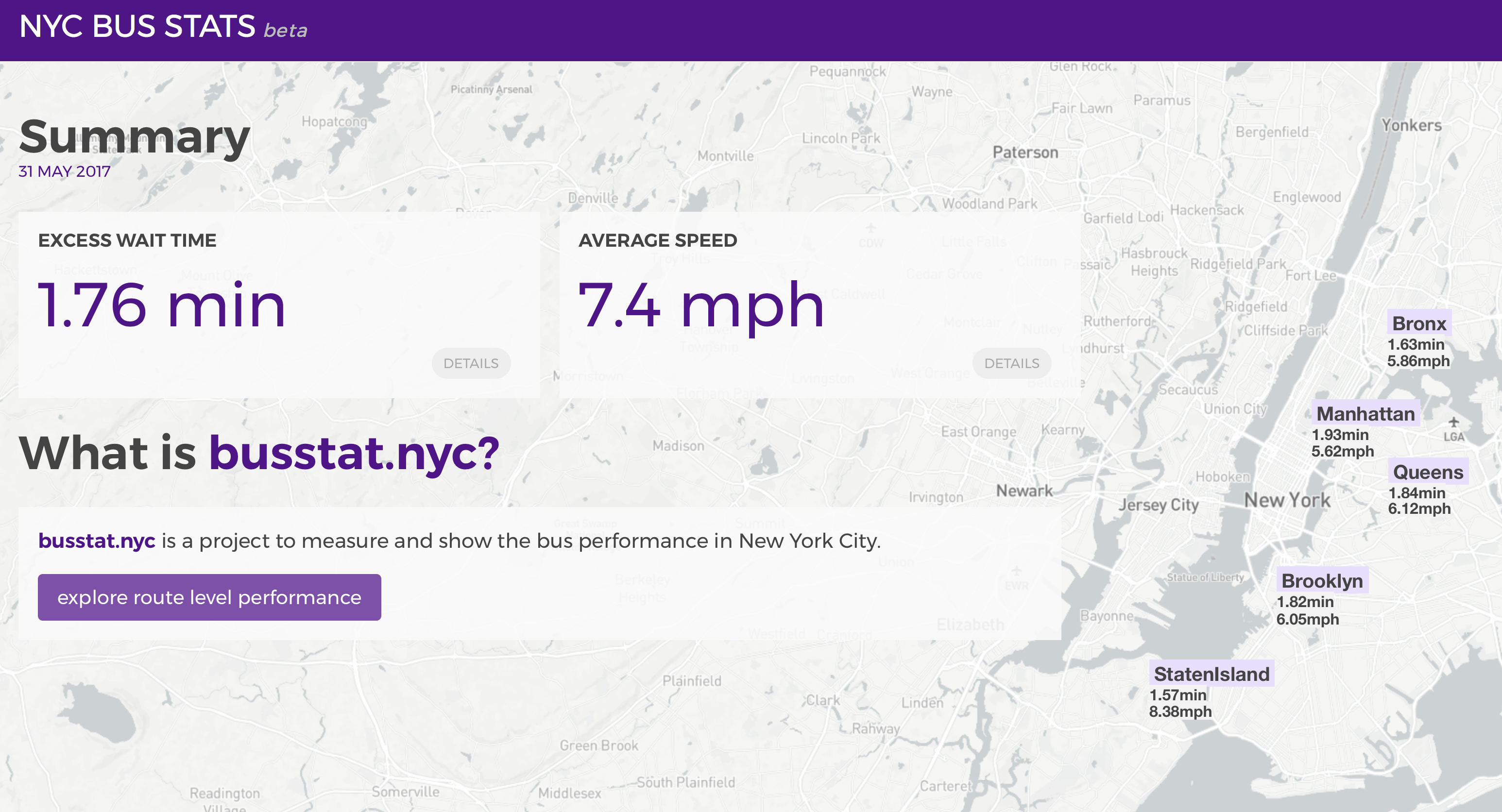
A team from the NYU Center for Urban Science and Progress (CUSP) has launched the “NYC Bus Profile Dashboard” evaluating 200 of the MTA’s bus routes using three performance indicators: average speed, excess wait time, and a novel metric the students are calling the “route lateness factor”. These indicators are meant to measure the quality of MTA’s bus service in a way that meaningfully captures the customer experience.
The students’ assignment was to develop a comprehensive performance measurement tool that was accessible and relevant to riders, agency board members, and staff — the sort of dashboard that the MTA can and should publish. They used the MTA’s real time bus data to underpin the dashboard, but the MTA’s dashboard should report on performance across the agency, including both buses and subways at a bare minimum.

While we may never know what a rider-focused dashboard covering the MTA’s entire portfolio of services would look like, here are five characteristics of a good transit dashboard. Some are drawn from the CUSP work, others from agencies with a stronger commitment to transparency than New York’s MTA:
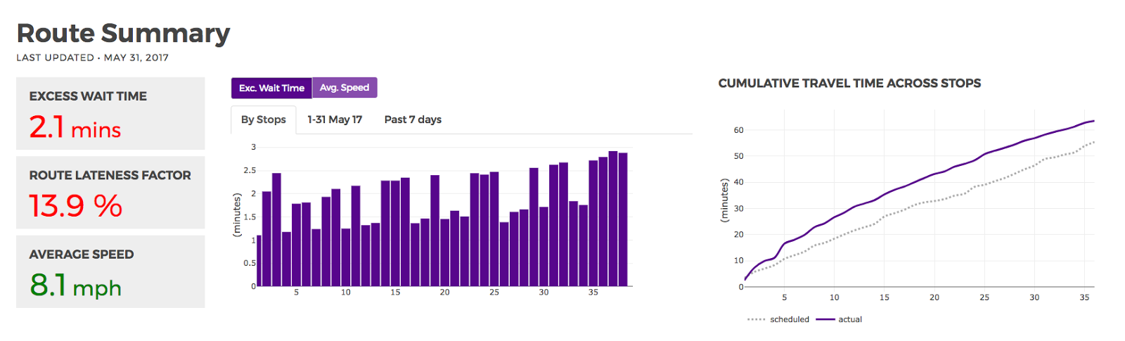
- Measures the right things. Not all metrics are created equal. Excellent dashboards measure and present the right information. They include both operational and customer-centric metrics that can be applied internally to evaluate service, all improvements upon the MTA’s “wait assessment” metric, which the agency now acknowledges to be flawed. For individual bus routes, the CUSP dashboard presents excess wait time (which we have written about at length) average speed, and ‘route lateness factor’ — an estimate of the average percent delay on the route. In English, that means with a route lateness factor of 20 percent, a trip that should take 15 minutes will take three extra minutes, or 18 minutes total, on average. These metrics capture what is most important to transit riders — compared with the schedule’s overly optimistic time estimates (scheduled journey time), how long should riders really expect to wait for and spend time on-board the bus, both on average (average journey time) and in order to plan to be on time at least 19 times out of 20 (‘planning’ journey time). Busy New Yorkers need to be on time, so these metrics, when considered together, tell the story of how transit riders really experience the MTA’s bus system.
- Easy to use. The dashboard should be easy to navigate and use for engaged members of the general public, journalists, and the MTA board, building on examples set by MBTA and NYU CUSP. Ideally, the MTA would seek out members of these groups to act as user-testers for its dashboard.
- Presents historical context. Performance data is not informative without the historical context needed to judge whether an agency is improving, plateauing or worsening over time. Both the data made available to the public and the dashboard itself should make historical trends clear, particularly year-over-year. The CUSP student dashboard includes six months of data (December 2016-May 2017) in this beta version, but is designed to support longitudinal analysis.
- Provides open and accessible data. Make performance data open and downloadable in an easily usable and machine-readable format — not only locked up in pdfs. MBTA does this through its dashboard as well as a publicly-accessible API. The MTA has also set a good precedent by internally using the same Bus Time data it publishes openly for developers to program – now it should provide the data in comprehensible form for the general public.
- Links metrics to goals. The best performance dashboards create a clear link between agency goals and specific performance metrics, and mirrors criteria used internally to evaluate staff and departmental performance. They can include goals anywhere from social equity to service reliability to disability access to fiscal responsibility. SFMTA’s performance metrics dashboard looks at key performance indicators and relates them to stated agency goals.
The new MTA leadership has the power and know-how to do something about the delays and uncertainty that bedevil New York City’s commuters. But to act requires an understanding of the problems, a willingness to communicate honestly and transparently about those problems, and accountability for the agencies responsible for solving those problems. The CUSP students have taken an important step to demonstrate how a common understanding of the problems facing NYC bus service can be articulated. The MTA would do well to do draw inspiration from these students’ ambitious work, using their considerable expertise and resources to demonstrate and advance industry best practice in their forthcoming dashboard — resolving a regional transit system in a state of “Emergency” must start with a clear understanding of the problems and strong accountability to the public who rely on that system.
The CUSP dashboard is built on an open platform, and the code can be found on GitHub here [https://github.com/nmonarizqa/nyc-bus-performance].
 On the Brink: Will WMATA’s Progress Be Erased by 2024?
The experience of being a WMATA rider has substantially improved over the last 18 months, thanks to changes the agency has made like adding off-peak service and simplifying fares. Things are about to get even better with the launch of all-door boarding later this fall, overnight bus service on some lines starting in December, and an ambitious plan to redesign the Metrobus network. But all of this could go away by July 1, 2024.
Read More Built to Win: Riders Alliance Campaign Secures Funding for More Frequent Subway Service
Thanks to Riders' Alliance successful #6MinuteService campaign, New York City subway riders will enjoy more frequent service on nights and weekends, starting this summer. In this post, we chronicle the group's winning strategies and tactics.
Read More