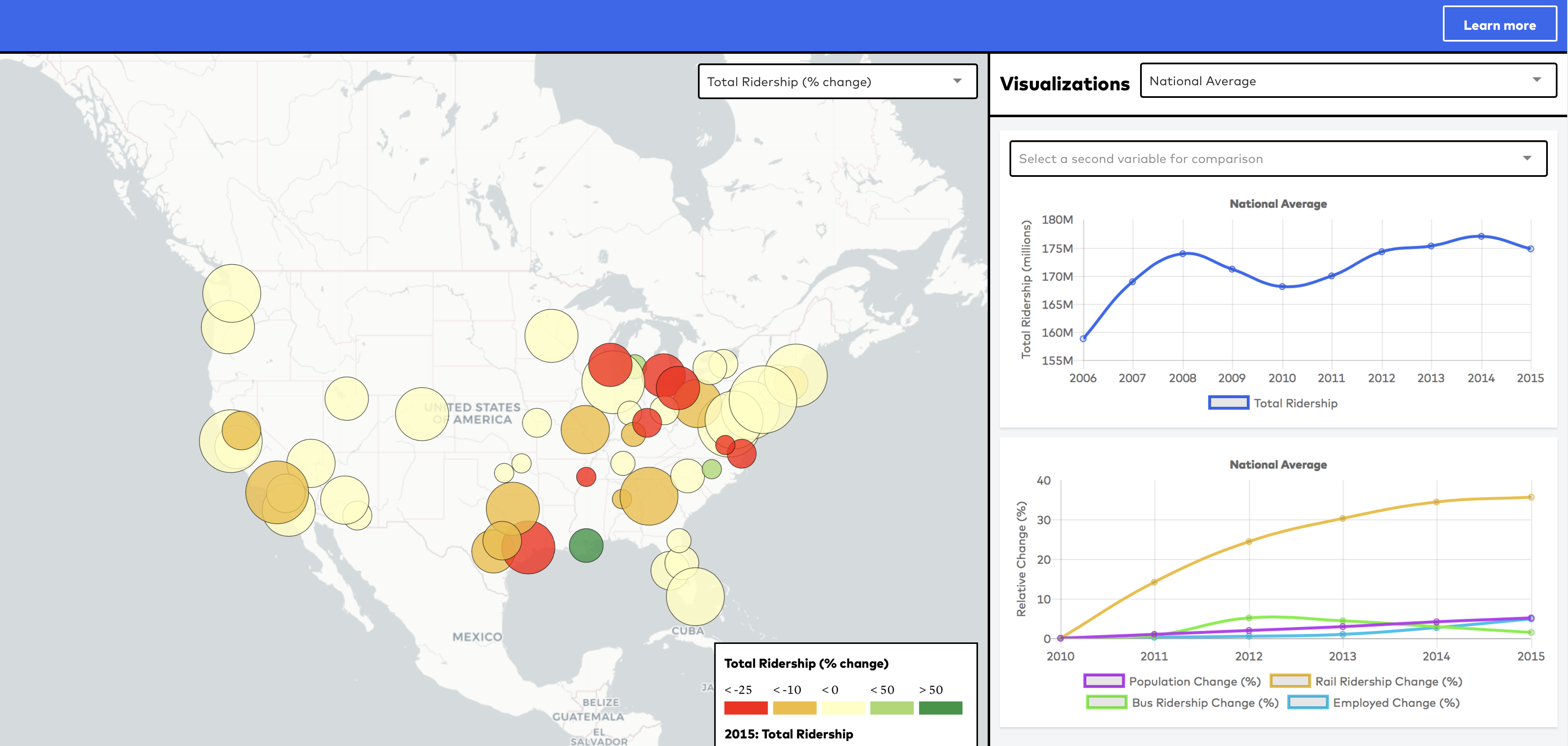
We are excited to debut a new tool that makes it easy for transit advocates, researchers, and journalists to better understand what’s going on with ridership in their region. As part of our new Ridership Initiative, we commissioned Azavea to build an interactive National Ridership Map to explore ridership trends in the country’s largest metropolitan areas.
This map uses American Community Survey (ACS) data and data from the Federal Transit Administration’s National Transit Database (NTD), which provides standardized ridership and operational data from all U.S. transit agencies. While NTD data are not granular enough to draw detailed conclusions, the consistency of FTA’s data-collection process enables comparisons among agencies and the exploration of long-term trends. ACS data add an important demographic and socioeconomic layer, which is available at the census tract level when you select a specific metropolitan region. As we often say at TransitCenter, all ridership is local.
We’ve aggregated data to the metropolitan statistical area (MSA) level to best facilitate inter-regional comparisons, since transit agency jurisdictions vary widely in scale. Summarizing data at the metropolitan level is still no substitute for detailed local analysis, sensitive to actual transit routes and neighborhood densities and demographics. The Ridership Map also displays data about trends — not current values. Try Data USA for more detailed census analysis, Social Explorer for census data maps, and the Center for Neighborhood Technology’s (CNT) AllTransit for transit quality statistics and maps.
Nonetheless, there is a lot you can learn just from using the Ridership Map. To provide some concrete examples, here are ridership stories from a few regions:
Chicago
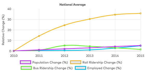
Chicago region’s bus ridership has plummeted in recent years in part because regional growth has been concentrated at the hub of the region’s hub-and-spoke rail system. Rail ridership rose during the same time period while population and jobs remained roughly stagnant in the region. Elected leaders in any region should be paying attention to what degree transit ridership has been keeping up with population and job growth, especially as more and more cities set targets for increasing the share of trips taken by using active or shared transportation options:
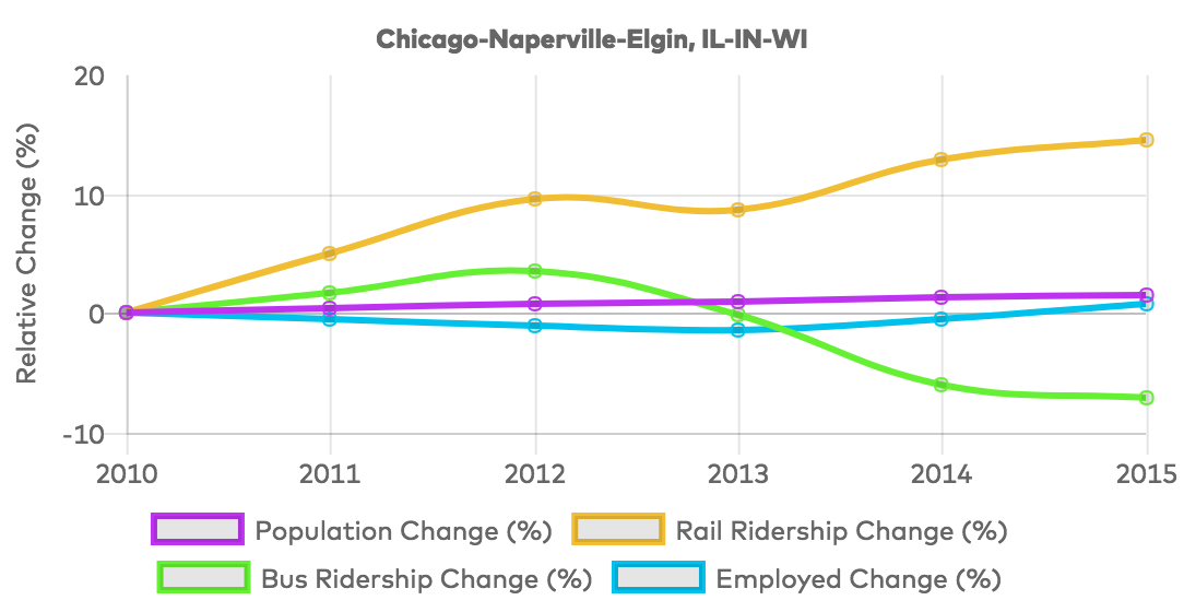
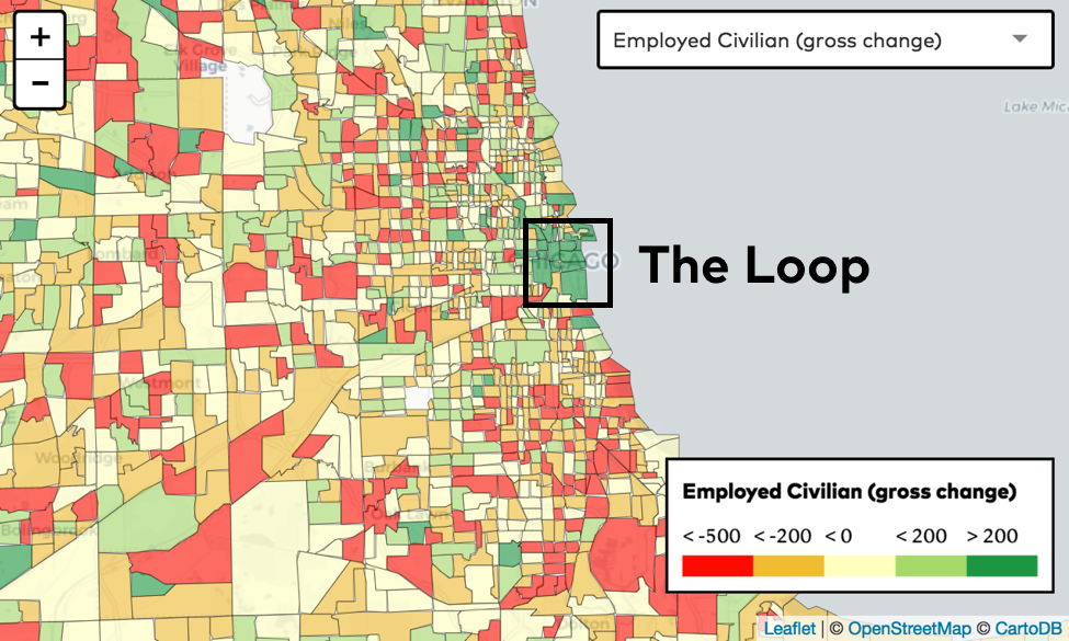
Chicago’s rail system is a hub-and-spoke network centered in the Chicago’s “Loop”. Job growth since 2010 has been concentrated in the Loop (the dark green area in the center of the map), squarely at the center of the rail network:
Meanwhile, population density has increased in the loop but been mixed in the neighborhoods surrounding — with more consistent decreases on Chicago’s South Side:
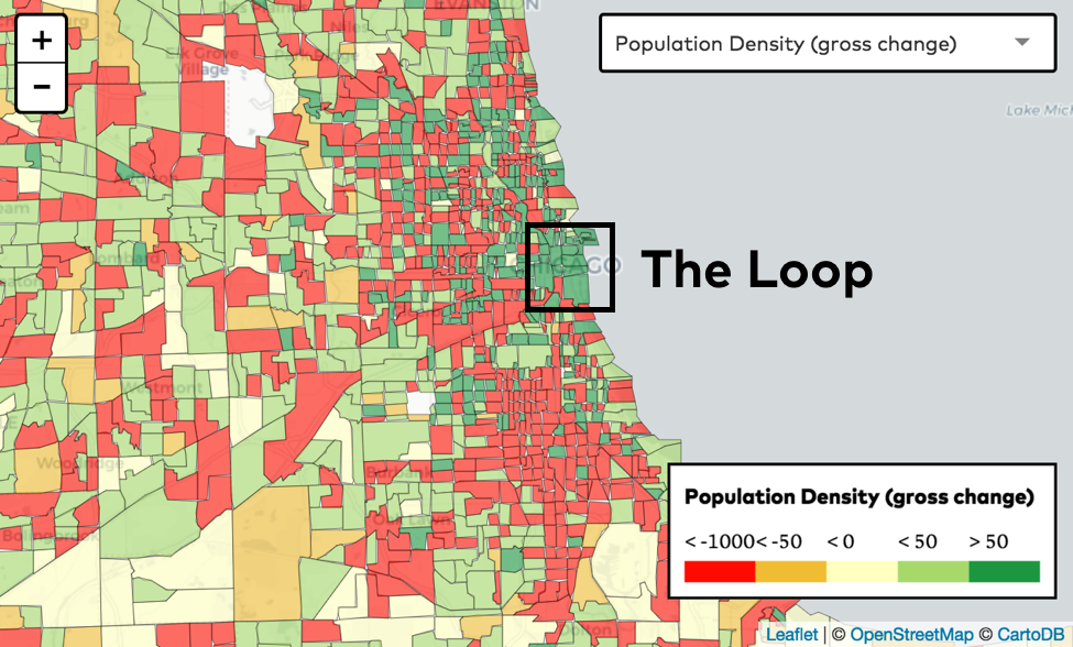
This all suggests a reason why rail ridership is going up while bus ridership declines — jobs and population are increasingly concentrated where rail service is best, making existing bus service less useful to the average Chicagoan.
New Orleans
Ridership trends in New Orleans stand out favorably on the map, but tell an incomplete story in the wake of post-Katrina recovery in the region.
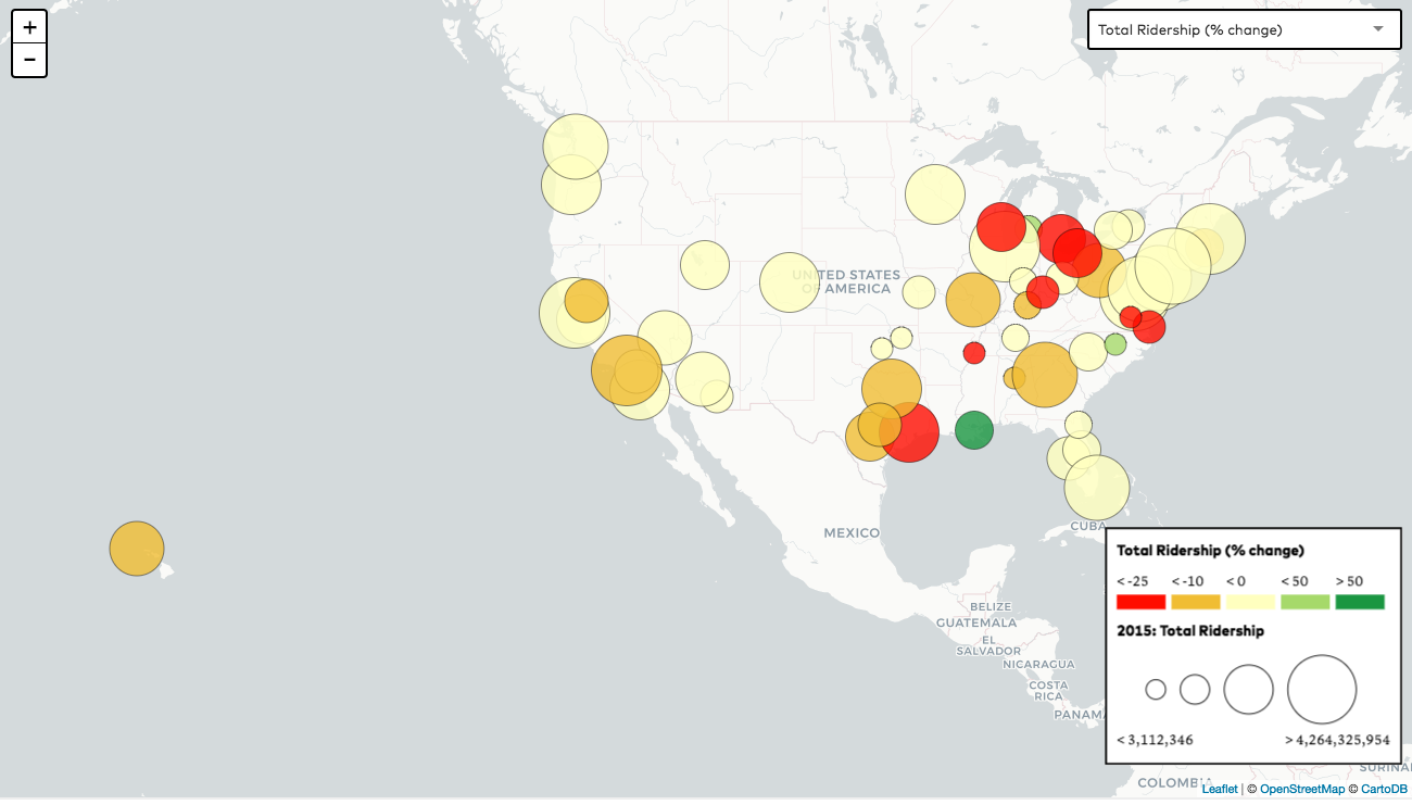
The choice of baseline year (in this case, to show ten years of data, starting in 2006) impacts the way we are visualizing trends on the map in some important ways. For example, transit ridership looks like it has been exploding in New Orleans, the nation’s lone dark green dot:
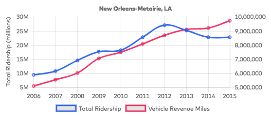
Of course, Hurricane Katrina hit New Orleans in 2005, decimating the region’s population and transit system alike. The system had nowhere to go but up, and the New Orleans RTA has consistently added service (as measured here in vehicle revenue miles) every year since:
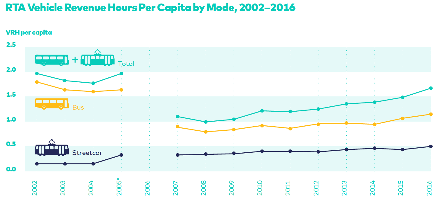
As we illustrate in A Bid for Better Transit, the recovery remains less than complete, with bus service additions lagging far behind streetcar relative to pre-Katrina levels:
This National Ridership Map is the initial release of a tool that we hope to expand over the course of the next year. We plan to add more national data (e.g. from CNT’s AllTransit tool), some new metrics, and even some detailed, region-specific case studies drawing on finer-grained ridership data at the route- or even stop-level.
Let us know if you have suggestions for or feedback on the map (including other features you’d find useful), ideas for specific cities in which to dig deeper, if you’d like help using the Map, or if you are an agency with data you’re willing to share, by emailing [email protected] or tagging us on Twitter.
 On the Brink: Will WMATA’s Progress Be Erased by 2024?
The experience of being a WMATA rider has substantially improved over the last 18 months, thanks to changes the agency has made like adding off-peak service and simplifying fares. Things are about to get even better with the launch of all-door boarding later this fall, overnight bus service on some lines starting in December, and an ambitious plan to redesign the Metrobus network. But all of this could go away by July 1, 2024.
Read More Built to Win: Riders Alliance Campaign Secures Funding for More Frequent Subway Service
Thanks to Riders' Alliance successful #6MinuteService campaign, New York City subway riders will enjoy more frequent service on nights and weekends, starting this summer. In this post, we chronicle the group's winning strategies and tactics.
Read More